Showing posts with label art. Show all posts

Tuesday, January 21, 2020

The Fillmore Funeral Train That Wasn't


Fillmore Funeral Locomotive
Created in Affinity Designer by the Author

The locomotive in the 1874 image was resplendent with polished brass and ornate decorations. A portrait of Millard Fillmore, the late president who had just died in March of that year, graced the side of the engine. A star-studded crest of American flags overlaid by the American eagle graced the tender. The side of the headlight was painted with a scene of Niagara Falls, a tribute to Fillmore’s upstate New York roots . Perhaps the only presidential funeral train with more patriotic decorations was that of Abraham Lincoln, nine years earlier. 

But unlike Lincoln’s train, Millard Fillmore’s funeral train never existed. Not only were the decorations on the side of the American Type 4-4-0 locomotive never installed, the locomotive itself was never built.  So why does this image exist? An art project I began awhile back provided the path that led me to unearth at least some of this strange story. 

Even as a kid, I had something of an artistic bent. I’d returned to dabbling in drawing and painting many times over the years - not that I ever stuck with it or got particularly good at it. Soon after personal computers were introduced, I was drawn to the graphics potential of these computers, but the programs that were available in those early days had very limited capability.  That has all changed. The power of reasonably priced graphics software has reached a level that people could only dream of a few years ago.  Recently, I bought a vector graphics software package called Affinity Designer for fifty dollars. Vector graphics software is based on nodes, lines and bezier curves and is infinitely scalable which means that the smallest detail and largest object can be rendered with equal clarity. 

Like all art techniques, graphics software requires practice and persistence to master the nuances of the tools. Much of this can be learned by trying to emulate or copy other work. Originality is not the objective, rather, command of the tools is the goal. Looking around the web, I saw that others had chosen images of cars, airplanes, or even cartoon characters as their models for replication. But I was looking for something different. I wasn’t sure what but it needed to have well-defined lines and not be too complicated. 

I thought of one of my favorite repositories for old images - the Library of Congress. Browsing through their Popular Graphics Arts collection, I found a lithograph dated  from 1874 titled simply, Railroad Engine. It looked like it might just do the trick. It appeared to consist of just a few circles, rectangles and other basic shapes. How long could it take to replicate it? 

Railroad Locomotive Lithograph, 1874, Library of Congress
I plunged into digitally tracing the drawing without giving the origin of the image much thought. I had seen other such prints of locomotives over the years. Engines of this era were often embellished with fancy ornamentation  and I assumed this was just another such locomotive from one of the many manufacturers of the day. The more I worked with the image, the more I began to appreciate the underlying design of this machine. Engineering has long practiced the maxim, “form follows function". But while this was evident in the locomotive design, the balanced proportions and the clean lines of many of the parts suggested a designer who cared for more than function alone. This was intended to be admired as a work of engineering art. 

 Being an amateur student of the history of technology, I knew a bit about old steam locomotives. But I certainly didn’t understand the details of how all the components contributed to the smooth operation of this machine. To do justice to this image, I wanted more information so I could represent the parts correctly.  When I am looking for information like this, one of my go-to places is Google Books. Google has scanned thousands of out-of-copyright books from academic libraries and placed them online with open access. Browsing under the topic of steam locomotive, I found the perfect guide, The Catechism of the Locomotive, by Matthias Nace Forney. https://en.wikipedia.org/wiki/Matthias_N._Forney.


First published in 1875, Forney’s illustrated six-hundred page book provides a complete guide to the design and operation of steam locomotives. His book contains almost 1,300 practical questions and answers for the novice locomotive designer or operator. The book was so well received, it continued to be published in revised editions for the next fifty years.

Detail from Catechism of the Locomotive

With the help of Forney’s book I made sense of the image I was tracing. I could see the details of the various parts and how they interconnected, what made it a functional machine. 

To trace all of the details in this image required a high resolution copy of the original lithograph. Fortunately, the Library of Congress has an online scan of the original print that is very high resolution. At 300 dots per inch, the image measures thirty-six inches long by twenty inches high. With such a high a resolution, I was able to trace every nut and bolt on the locomotive. No detail seemed to have been omitted. As my work continued, I became more curious about the origins of the image. 

As noted on the print, it was the designer, A.J. Johnson, not the lithography company who submitted the print to the Library of Congress.  A stamp in the lower left corner noted that the print had been received by the library in the same year it was created -1874.

W.J. Morgan Company was listed as the publisher of the lithograph. A little searching found that the lithography company was founded in Cleveland, Ohio shortly after the Civil War by two brothers: William J. and George W. Morgan. Their business focused mostly on broadsheets, pamphlets, and later, theatrical posters. They also produced fine lithographs for stock certificates and other needs. 

Bridge Lithograph by W.J. Morgan Co. 


Detail of Lithograph
But the lithograph of the locomotive had no visible commercial connection. It seemed not to be an advertisement for a manufacturer of locomotives. Why would the Morgan Company invest time and effort to produce this piece? Why would Johnson think it should be in the Library of Congress? The answer may be found by studying the details of the locomotive. 

Detail of Lithograph
The library record and the lithograph itself lists A.J. Johnson as the locomotive designer. A Google search of that period for the name found no one by that name who designed steam engines. I also searched online in old railroad magazines and books from the era but found no reference to A.J. Johnson. Who was he?

I began to wonder if perhaps the portrait on the side of the engine was that of President Andrew Johnson and the locomotive designer was a coded hint as to the name of the person in the portrait. President Andrew Johnson had no middle name and the builder was specifically listed as A.J. Johnson. Nor did the portrait look much like Andrew Johnson except perhaps in style of dress. I concluded that A.J. Johnson and Andrew Johnson were not the same man.

Andrew Johnson

Image on Side of Locomotive

I checked the U.S. Census records for Cleveland for 1870 and 1880 using the online databases at Ancestry.com. When I put in a rough guess of his age as 25, the search engine soon found an A.J. Johnson listed as living in Cleveland in 1870. The census listed him as being born in Ohio in 1848 and gave his occupation as being a  “Locomotive Builder”. I thought this might be my man.

In 1870, A.J. Johnson was a twenty-two year old living in a commercial hotel with a dozen other men with various occupations. No spouse was mentioned as living with him. The designation on the census of “locomotive builder” was most likely a bit of a personal exaggeration on A.J.’s part although I’m sure that is what he wanted to become. By the time of the 1880 census, AJ. Johnson was still living in a Cleveland boarding house but now he listed his occupation as “Riveter”. 

1870 Census Cleveland, OH


1880 Census Cleveland, OH

While A.J. (the name recorded on the census)  seems not to have had much of a career as a locomotive designer, he seems to have drawn at least one locomotive - the one in the lithograph. But this still didn’t answer how Johnson got connected to the W.J. Morgan Lithography Company. Did Johnson approach the Morgan Company to see if they would publish his design as a way to advertise his skills? Perhaps. Given his age and boarding house residence, it seems unlikely he would have had the cash to pay for such a printing project.

No, I think this lithograph emerged by serendipity. in 1874, W.J. Morgan Company was expanding into markets outside of Cleveland. They were developing a reputation for high quality lithographs. Eventually, they would claim to be one of the largest lithography companies in the United States. Morgan Company was looking for a way to place themselves before a broader audience - a national audience - and grow the business. 

With not much else to go on, I continued to search the web for any other information I could find about this particular locomotive image.  I got a hit at the Getty Images archive. The identical image was listed in their database but there it was identified as the Fillmore Funeral Train. Unlike the Library of Congress who had gotten the image directly from A.J. Johnson, Getty Images listed their source as a private collector of lithographic prints. The collector had entitled the print the "Fillmore Funeral Train". 

Millard Fillmore as Congressman
That sent me in search of information about our 13th president, Millard Fillmore. Fillmore died on March 8, 1874 in Buffalo, New York. Fillmore had lost a bid for re-election in 1856 and returned to his native Buffalo where he was a leading citizen of the city throughout the Civil War and post-war years. Could the portrait be that of Fillmore? Comparing an image of him taken by Matthew Brady in 1850 with the image on the side of the locomotive made me think that it was indeed Fillmore. But why would W.J. Morgan print an image of a locomotive with Fillmore on the side?

Image of Fillmore on Side of Locomotive
When Abraham Lincoln was assassinated in April of 1865, his funeral train made a long and circuitous journey from Washington, D.C., back to Springfield, Illinois where he was buried. One of the many stops along the route was Buffalo. Ironically, Fillmore was out of town at the time. Lincoln’s funeral train was met by tens of thousands of mourners at every stop on its journey to Illinois. The flag-draped train bearing Lincoln’s sarcophagus was emblematic of the fallen leader. His funeral train became synonymous with a proper funeral for a dead president. 

Of course, Fillmore had died in his home city of Buffalo and no funeral train was ever planned or used to carry his body to its final rest. But I would be willing to bet that either William or George at W.J. Morgan Company reasoned that if they created a lithograph of a steam engine with Millard Fillmore’s image and resplendent presidential trimmings, they could sell this image to the people of the country to mark the passing of another president. They just needed an image of a steam locomotive. While many manufacturers of steam locomotives might have been only too happy to provide an image for the project, Morgan Company must have reasoned that an unaffiliated design would be seen as less an endorsement of any one manufacturer. The company would surely not have wanted to create bad blood with potential future advertisers. 

Enter A.J. Johnson with his highly detailed drawing of a locomotive. The timing was right for a “collectible" tribute to Fillmore. Morgan Company only had to do have one of their artists embellish Johnson’s design with Fillmore and other Americana and they would have their image. 

And so was created a locomotive that never existed, decorated for a presidential funeral that never happened. But the image lives on and its elegant design is a clear testament to the design aesthetic of that era. 

Uncolored Tracing of Lithograph

Vector Graphics Colorization Detail in Affinity Designer

I began the project as a way to learn a new software tool. I hadn’t anticipated a detective story. Of course, I may be wrong about all this - but I think this contains much of what transpired in 1874. A.J. Johnson might never have built a locomotive but he has been immortalized as a locomotive designer by his image housed at the Library of Congress. 

Oh, and as for my software learning project, well, I would say it was a success. After tracing and shading hundreds of objects, I think I have it figured out. There’s just no substitute for practice.

Monday, January 6, 2014

Art and Technology

Art and technology share common roots - creativity and imagination.  While technology expresses itself more in objects of utility, art captures and creates objects of beauty. Often, technology is not only useful but beautiful. Both technologists and artists have known this for millennia. Think of Leonardo's beautiful drawings of his many inventions.


Google continues to try to document the world and bring it to our desktop, tablet, and smartphone. One of their more recent explorations is the Google Cultural Institute which aims to bring some of the finest works of art from the world's museums to the internet. I thought it would be fitting from time-to-time to highlight a few of the art works found on the Cultural Institute website that depict the world of technology as seen by the artist. Let's start with two works from the Laing Art Gallery in Newcastle-Upon-Tyne, UK.  Newcastle has long been one of the great industrial and shipping areas of the UK and it is not surprising that artists have captured this activity in their art.

Here are two examples that depict the history of Newcastle. The Tyne Bridge was modeled after the Hell Gate Bridge of 1916 in New York.

(Click on images to obtain larger view.)

On The Tyne - Shipbuilding
Thomas William Pattison
1954


The Building of the Tyne Bridge
Edmund Montgomery O'Rourke Dickey
1928

Monday, February 13, 2012

The Serpent and the Telegraph

It's interesting how connections sometimes come about. I am on an email list for the Library of Congress and there was a post on their blog about Hans Christian Andersen (yes, the same Andersen of fairy tale fame). The blog post was announcing that an American family had donated some letters between one of their family members and Andersen that were written in the 1860s and 1870s. The blog mentioned that some of Andersen's stories, including "The Great Sea Serpent", had first appeared in english language publications such as Scribner's magazine.  The "Serpent" appeared in the January, 1872 issue.

"The Great Sea Serpent" is a fairy tale of how the fishes and sea creatures reacted to the laying of the Trans-Atlantic Telegraph Cable in 1866.  In the story, the cable is thought to be some great sea serpent that originated from the creatures on the surface. The fish were trying to decide whether to bite it in two because they despised its presence in their world. The wise ones among them advised the more adversarial fish to leave it alone. The story ended with this paragraph:

Good for nothing!” said all the creatures in the sea, and held fast to the sea-cow’s opinion, so as to have an opinion. The little fish had its own thoughts. “That exceedingly long, thin serpent is perhaps the most wonderful fish in the ocean. I have a feeling it is.

The very most wonderful,” say we human folks, and say it with knowledge and assurance. It is the great sea-serpent, long ago the theme of song and story. It was born and nourished and sprang forth from men’s cunning and was laid upon the bottom of the sea, stretching from the Eastern to the Western land, bearing messages, quick as light flashes to our earth. It grows in might and in length, grows year by year through all seas, round the world, beneath the stormy waves and the lucid waters, where the skipper looks down as if he sailed through the transparent air, and sees the swarming fish, brilliant fireworks of color. Down, far down, stretches the serpent, Midgard’s snake, that bites its own tail as it encircles the earth. Fish and shell beat upon it with their heads—they understand not the thing—it is from above. Men’s thoughts in all languages course through it noiselessly. “The serpent of science for good and evil, Midgard’s snake, the most wonderful of all the ocean’s wonders, our—GREAT SEA-SERPENT!

I always find it interesting when technology intersects with art and literature. Who would have thought that something like the Trans-Atlantic Telegraph Cable would inspire a fairy tale? And yet, through the form of the fairy tale, we see Andersen revering the cable as one of mankind's greatest achievements. He was not alone.  The cable of 1866 (there had been an earlier attempt that failed in the 1850s) would connect the continents and that connection would never again be broken.

Now, of course, the telegraph looks so terribly antiquated.  We can hardly imagine that messages would have taken two weeks to travel in letters from England to America before the advent of the Trans-Atlantic telegraph. I wonder if Hans Christian Andersen was alive today, would he write a fairy tale about the internet? Would we have something like "The Great Spider Web of Communications"?  It would be nice to think so - but somehow I doubt it.

Sunday, November 13, 2011

The Art of the 20th Century Limited

Having just written in my previous blog post about the 20th Century Limited, the premier passenger train run by the New York Central Railroad, I thought I might share a couple of iconic poster images of this train made by the well-known graphic artist, Leslie Ragan. Ragan was born in Woodbine, Iowa in 1897 and trained at the Art Institute of Chicago. He taught there for awhile and later moved on to New York and then Europe. During the 30s and 40s, Ragan did quite a bit of commercial illustration for the NYC RR. But Ragan's poster images of the streamlined Hudson locomotive - with industrial design by Henry Dreyfuss - stand as icons of what we today call the Machine Age. These images seem to exude the power of the mighty locomotive at its pinnacle of success.

Poster from 1938
Poster from 1946
Railroad posters fell out of favor after WWII. The automobile took over the medium and  long-distance travel that use to be the domain of the railroads. The advent of the interstate highway system in the 50s was the final nail in the passenger train coffin.  But the images live on and give us a sense of what once was - or more accurately - what we like to think once was.

Tuesday, October 26, 2010

The Art of Technology

Technology always exists within the culture.  Technology also shapes the culture in ways both subtle and obvious.  But technology would have been one of the last subjects of interest to early 19th century American artists.  The Back Story of America was the opening of a virgin continent, the taming of the wilderness, and the westward expansion that was for some our Manifest Destiny.

The earliest landscape artists painted bucolic scenes of the Hudson River Valley - from which they drew their group identity, becoming known as the Hudson River School.  Technology in the landscape was hard to see even in the 1820s.  There might be a steamboat in the distance on the Hudson but most often painters such as Thomas Cole (1801 - 1848) painted their landscapes without machines.  But even Cole payed tribute to the settling of the land in his 1836 painting, The Oxbow (The Connecticut River near Northhampton).  Cole's painting is seen as one of the first clear visual statements of the difference between the settled land with well-tended farms (as seen on the right) and the yet unspoiled but ominous wilderness (on the left).

Thomas Cole, The Oxbow, 1836
Metropolitan Museum of Art, New York

Railroads came to America in 1829.  The railroad became the embodiment of technology change made visible, or to use Leo Marx's phrase, the railroad was "the machine in the garden."  Artists still didn't make technology a prominent feature in their paintings but it did start to have some presence, perhaps being represented by a distant steam locomotive seen in the far distance.  The landscape itself still dominated.  

As the 19th century progressed, the emerging place of technology became self-evident.  Artists began to be commissioned for paintings featuring technology as the main subject.  This was clearly the case with what has come to be seen today as the best example of 19th century technology art, "The Lackawanna Valley," by George Inness (1825 - 1894).

George Inness, The Lackawanna Valley, ca. 1855
National Gallery of Art, Washington, DC
This painting has an interesting history.  It was apparently commissioned by the directors of the Delaware, Lackawanna, and Western Railroad either for use in advertising or to decorate the walls of the company's offices. No one knows for sure. Inness was only about 30 years old when he painted it and was newly returned from an extended stay in Europe.  The scene depicted is of the Lackawanna's engine house (the round building in the center distance) in Scranton, PA. The picture is an idealized rendition of (what was in reality) a much flatter and uglier landscape as can seen in contemporary photographs of Scranton. But the picture places the train smack dab in the center and the engine house prominently in the distance.  Despite these placements, the landscape still speaks of tranquillity and the rural life.

Apparently, the railroad directors didn't much like the picture.  There is no mention of it in any surviving records and there are no engravings made from it for advertising.  When Inness had been in France, he had become enthralled with the Barbizon School of painting which was moving away from the older style of the Hudson River School. Inness was paid $75 to paint the work, money he desperately needed at this early stage in his career.  There isn't even agreement on the date of the painting or its original title.  It has become popularly known as The Lackawanna Valley but it was never named that by the artist.  It might have been painted in 1857, rather than 1855, because that was the year that the engine house was completed.  

Many decades latter, in 1891, George Inness was in a junk shop in Mexico City and he found his painting (which was quite large at 34 in by 50 in) piled in a corner.  The shop owner told Inness that he had acquired it in a load of old office furnishings.  Inness bought his old painting back for a few dollars, which is the only reason we have it at all.  The painting now hangs in the National Gallery in Washington, DC as one of the great masterpieces of 19th century American art. 

Technology both creates culture and is created by culture. From time-to-time, I hope to put some other artwork on the blog. It helps me, at least, to see the world as a whole.

Reference:

The Railroad in American Art, Representations of Technological Change, Edited by Susan Danly and Leo Marx, The MIT Press, 1988.


Saturday, October 16, 2010

The Panorama: IMAX of the 19th Century

No matter what direction they looked, the battle raged around them.  The agony of the dead and dying, the chaos of Pickett's Charge, the noise, smoke and confusion was everywhere visible.  The sense of being there was overwhelming, yet the scene they observed had happened 20 years earlier.  The time machine that transported them there was a cyclorama.

A couple of days ago, I came across a reference to Louis Le Prince who was the inventor who had been credited as being first to create a motion picture.  I put a link up on my Facebook TechAlmanac to his two-second, 1883 film entitled "Roundhay Garden Scene." I started reading a little more about Le Prince and learned that he had emigrated from France - first to England and then to New York - in the mid-1880s. One of his jobs was to manage the Monitor and Merrimac Panorama exhibition.  I had never heard of a cyclorama so I started doing a little investigating.  What I found was a fascinating history of a form of entertainment that mesmerized those in the late 19th century who saw such a display.

Panoramas (also interchangeably called Cycloramas) were gigantic paintings that were displayed inside specially-constructed round buildings so that the painting completely surrounded the viewer.  The painting could be 350 to 400 feet in circumference and 25 to 40 feet high.  The viewers would typically climb stairs to a high platform in the center of the building so that their viewpoint was that of being on a high hill.  Often, the panorama was also combined with real foreground elements such as trees, fences, or (if it was a military scene) cannons and other armaments.  The illusion of being in the painting was said to be overpowering.

The cyclorama was patented by and Englishman named Robert Barker in 1787.  Barker was the first to coin the term panorama from which the adjective "panoramic" entered the lexicon in 1813.  Barker's first panorama was a view of Edinburgh. He later displayed a second panorama of London as seen from the roof of Albion Mills and it was wildly successful.  Hundreds more such scenes followed by other artists and were displayed across England and Europe.

In the United States, the first panorama was painted by John Vanderlyn in 1818 and was entitled, "A View of the Palace and Garden of Versailles".  The painting was originally displayed in a special building in New York City called the Rotunda. The panorma has survived and is now housed in a round hall at the Metropolitan Museum of Art.  It is one of only three historical panoramas that can still be seen in this country.

Paul Phillippoteaux
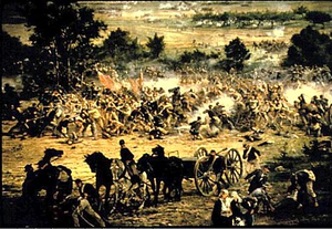
The second and perhaps the most famous is "The Battle of Gettysburg" which was painted in 1883. The panorama captured the scene on July 3, 1863, the third and final day of the epic battle, at the time that Confederate General George Pickett commanded a charge of 12,500 troops against an entrenched Union positions.  The result was a bloodbath for the Confederates with over fifty percent rate casualties. The cyclorama painted was painted on commission from Chicago investors by French artist, Paul Dominique Phillippoteaux and a team of other artists. It was first displayed in Chicago on Oct. 22, 1883 to critical acclaim.  As painted, the original was 365 feet in circumference and 42 feet high. Three copies of the Gettysburg Battle were subsequently created by the artist and his team for display in other cities. The first copy, which opened a year later in Boston, found its way years later to the Gettyburg National Military Park in Pennsylvania. It has been displayed there since 1912. It was recently renovated and moved to a brand new exhibition building in the Park.

A Portion of the Gettysburg Cyclorama

The third existing historical cyclorama is titled "The Battle of Atlanta" and is on display in Atlanta, GA.  While this battle depicts the North's victory in Atlanta, it is still cherished as a reminder of the Confederacy's resistance to the decimation of Atlanta by General William Tecumseh Sherman.

There were many more of these huge paintings that were shown in traveling displays to hundreds of thousands of people.  Some titles included "The Battle of Shiloh", "The Battle of Second Manassas", and (the one that got me going in the first place) "The Battle of the Monitor and Merrimac". You might think that it would be hard to lose paintings this large.  After all, the combined paintings making up the cyclorama usually weighed about 10,000 pounds and, even rolled up, would have been 30 to 40 feet long.  Some were lost to fire, others were undoubtedly thrown out when the fashion for these paintings passed. Still others were cut up to make smaller paintings for framing.

One interesting footnote came to light almost in my backyard.  An artist named Joseph Wallace King of Winston-Salem, NC became obsessed with finding one of the missing Battle of Gettysburg cycloramas and stayed on the hunt for decades.  In the 1960s, he got word that one of them might be in a warehouse in Chicago.  When he went to the location, he was told that the old warehouse had burned down a few years before but he went in to the new one and found a fire-blackened back wall.  For whatever reason he thought there might be something behind the wall and talked the owner into letting him punch a hole through to check.  Behind the wall lay one of the stored copies of the Gettysburg cyclorama.  He bought the painting and brought it back to Winston-Salem and unrolled the paintings end to end in the Bowman Gray football stadium.  They even had to take the goal posts down to put all the pieces end to end. King died in 1996 while trying to get the paintings restored and redisplayed.  He bequeathed the cyclorama to Wake Forest University.  In 2007, three unidentified investors from Raleigh bought the painting from the University for a reported $10 million and are seeking other investors to restore and display it.

Cycloramas were the IMAX of their day.  They provided a spectacle and an immersive experience that took viewers to other places and other times.  In the days before motion pictures, they must have been truly extraordinary.  But like every technology, these massive paintings became a dated form of entertainment.  The painting that was found in the old Chicago warehouse was last displayed at the Chicago World's Fair in 1933 and was a Midway attraction, not even one of the major exhibits.

I wonder what the next century will bring in immersive experience.  With the rate of acceleration of virtual reality software it is likely that we will get to the point where we will be able to inhabit places indistinguishable from the real world.  We are almost there now. I can imagine a future virtual theater recreating an even more powerful rendition of the Battle of Gettysburg.  On the other hand, there have been so many battles since that epic conflict that it might be hard to chose which battle to recreate.

Further reading:

Saving the IMAX of its Day - American Heritage Magazine
The Velaslavasay Panorama
Official Website of the International Panorama Conference with lists of other panoramas by country.